
Aaron Software
Aaron Software is a minimalist and modern visual style that was popularized in the late 2000s. It is characterized by clean lines, bold typography, and a focus on user experience.
View StyleExplore Style Stylopedia
A visual encyclopedia of bold typography styles – use as prompt inspiration for Midjourney, Gemini, or ChatGPT AI when making bold typography images
Aaron Software is a minimalist and modern visual style that was popularized in the late 2000s. It is characterized by clean lines, bold typography, and a focus on user experience.
View StyleExplore Style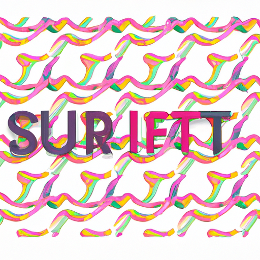
The visual style of Alan Fletcher is characterized by its simplicity and playfulness. It emerged in the late 1950s and became prominent in the 1960s and 1970s. Fletcher's style is famous for its use of minimalistic elements, bold typography, and clever visual metaphors. His work often combines bright colors, geometric shapes, and witty illustrations to convey complex ideas in a simplified manner. Fletcher's innovative approach to graphic design revolutionized the industry and made him one of the most influential designers of the 20th century.
View StyleExplore Style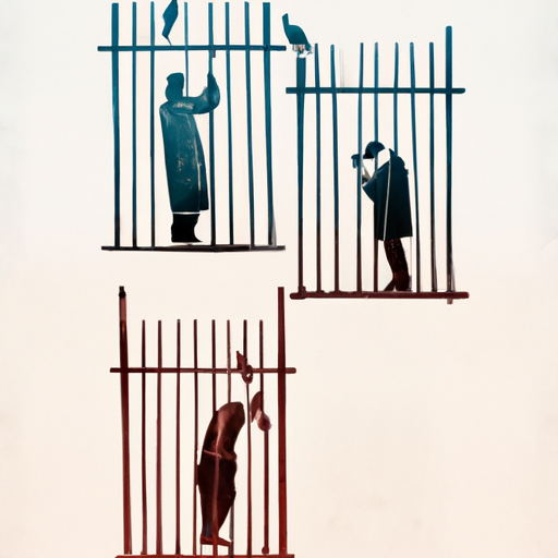
Alexey Brodovitch was a prominent art director and designer known for his innovative work in the field of graphic design. He rose to prominence in the mid-20th century, particularly during his tenure as the art director of Harper's Bazaar from 1934 to 1958. Brodovitch revolutionized editorial design by introducing dynamic layouts, bold typography, and asymmetrical compositions. His use of large-scale photographs and innovative cropping techniques became his trademark and greatly influenced the future of magazine design. Brodovitch's work was characterized by its avant-garde aesthetic, combining a modernist approach with a strong emphasis on visual impact and storytelling.
View StyleExplore Style
The visual style associated with Benito Mussolini's leadership in Italy from 1922-1943, characterized by propaganda posters glorifying Fascism, featuring bold typography, strong colors, and images of Mussolini as a heroic figure.
View StyleExplore Style
The visual style associated with Bob Marley emerged during the late 1960s and early 1970s, particularly with the release of his album 'Catch a Fire' in 1973. This style became famous for representing the reggae music and Rastafari movement. It features vibrant colors, bold typography, and a strong emphasis on Jamaican cultural motifs, such as Jamaican flag colors, marijuana leaves, and lion imagery. This style is deeply rooted in African symbolism and spirituality, highlighting Bob Marley's advocacy for social justice and peace.
View StyleExplore Style
Bristol Sound is a style of visual design that emerged in the 1990s in the city of Bristol, UK. It is known for its vibrant and eclectic mix of colors, bold typography, and use of geometric shapes. This style became famous for its association with the music scene in Bristol, particularly with the rise of trip hop.
View StyleExplore Style
The California Music Scene visual style emerged in the 1960s and 1970s in California, USA. It is characterized by colorful, psychedelic graphics, bold typography, and imagery inspired by nature and the hippie counterculture. This style became famous for its association with iconic music festivals like Woodstock and artists like The Grateful Dead and The Doors.
View StyleExplore Style
Chris Harrison is known for his clean, minimalistic, and modern visual style. His work often features bold typography, sleek layouts, and vibrant color palettes. Harrison rose to fame in the early 2000s for his innovative approach to design and usability.
View StyleExplore Style
The Larry Page style is characterized by clean and minimalistic design elements, bold typography, vibrant colors, and innovative layouts. This style became famous in the early 2000s for its focus on user experience and simplicity.
View StyleExplore Style
Contemporary Book Cover Design is characterized by minimalist and modern design elements, bold typography, abstract imagery, and vibrant colors. This style became prominent in the late 20th century and continues to evolve with current design trends.
View StyleExplore Style
Craig Adams is known for his minimalistic and modern design aesthetic. His work is characterized by clean lines, bold typography, and simple color palettes. Adams gained fame in the early 2000s for his innovative approach to web design, focusing on user experience and functionality.
View StyleExplore Style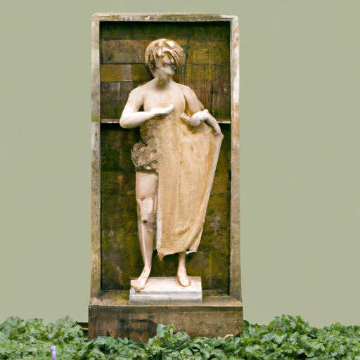
The David Airey visual style is known for its clean and minimalist design, with a focus on bold typography and striking compositions. This style emerged in the mid-2000s when David Airey, a renowned graphic designer, gained recognition for his influential blog and book on logo design. The use of negative space and balanced layouts are key elements that make this style famous.
View StyleExplore Style
Project Pat is a visual style characterized by colorful and exaggerated graphics, often featuring bold typography and street art influences. Popular in the late 2000s and early 2010s, this style became famous for its energetic and urban aesthetic.
View StyleExplore Style
Debbie Millman is known for her eclectic and expressive visual style which emerged in the late 1990s. Her style combines bold typography, vibrant colors, and illustrative elements to create visually captivating designs. Millman gained fame through her work as a graphic designer and renowned design educator. She has also contributed significantly to the field of branding and has been a prominent figure in design podcasts and publications.
View StyleExplore Style
Esquire is a visual style that emerged in the early 20th century and became famous for its elegant and sophisticated design. It is closely associated with the renowned American men's magazine of the same name, which was first published in 1933. Esquire style is characterized by its use of bold typography, clean lines, and minimalist layouts. This style gained prominence during the mid-20th century when Esquire magazine played a significant role in defining the visual language of modern design and fashion. The iconic covers and spreads of Esquire have showcased the work of renowned photographers, illustrators, and artists, making it a highly influential and respected visual style in the publishing industry.
View StyleExplore Style
The Fred Silverman visual style is characterized by vibrant colors, bold typography, and dynamic compositions. It emerged during the 1970s and 1980s, a period that marked the golden age of American television. Fred Silverman, a renowned television executive, played a significant role in shaping the style through his innovative approach to programming. He introduced a number of successful shows and implemented visual strategies that captivated audiences. The style became famous for its ability to create attention-grabbing and memorable designs that stood out from the competition.
View StyleExplore Style
Helen Yentus is known for her minimalist and conceptual design style, often incorporating bold typography, geometric shapes, and vibrant colors. Her work has gained recognition in the design world for its unique and striking visual appeal.
View StyleExplore Style
The visual style associated with Hunter S Thompson is a blend of counterculture, psychedelic, and gonzo journalism. Known for its bold typography, vibrant colors, and chaotic layouts, this style emerged in the 1960s and became famous through Thompson's writing and artwork in publications like 'Fear and Loathing in Las Vegas'.

James Grimes is known for his dynamic and vibrant use of colors, bold typography, and geometric shapes. His work gained popularity in the 1960s for its modern and cutting-edge design.
View StyleExplore Style
The Jessica Walsh visual style is characterized by vibrant colors, bold typography, and playful graphics. It gained popularity in the 2010s and is often associated with the influential design agency Sagmeister & Walsh, which Jessica Walsh co-founded. Her use of unconventional layouts and experimental design approaches has made this style famous in the world of graphic design.
View StyleExplore Style
The John Snow Graphic Designer style emerged in the early 2000s and became famous for its minimalist and clean designs. Inspired by the iconic work of John Snow, this style focuses on simplicity and attention to detail. John Snow's use of bold typography, vibrant colors, and clever use of negative space set him apart as a trailblazer in the graphic design industry. This style gained popularity for its ability to effectively convey messages with minimal elements, creating visually stunning and impactful designs.
View StyleExplore Style
Joost Swarte is a Dutch cartoonist, graphic designer, and typographer known for his clean lines, strong color schemes, and bold use of typography. His work gained fame in the 1970s and 1980s for its unique blend of comic art, illustration, and design.
View StyleExplore Style
Lotfi Benmoussa is a contemporary graphic designer known for his minimalist and modern approach. His work often features clean lines, bold typography, and a limited color palette, reflecting a sleek and sophisticated aesthetic. Benmoussa gained recognition in the early 2000s for his innovative designs in branding and editorial projects.
View StyleExplore Style
A modern and sleek visual style characterized by clean lines, bold typography, and minimalistic design elements. Popularized in the late 20th century, it emphasizes strong branding and global recognition.
View StyleExplore Style
The visual style of Metro Boomin is characterized by clean, minimalist design with a focus on bold typography and high contrast color palettes. Inspired by the music producer of the same name, this style became famous in the late 2010s for its sleek and modern aesthetic.
View StyleExplore Style
The Mike Jones visual style is characterized by vibrant colors, bold typography, and playful illustrations. This style became popular in the early 2000s and is known for its energetic and whimsical designs.
View StyleExplore Style
Missy Knowles is a visual style characterized by bright colors, dynamic patterns, and bold typography popularized in the early 2000s. This style became famous for its energetic and playful aesthetic, often incorporating elements of hip-hop culture.
View StyleExplore Style
Nathan Bond is a graphic designer known for his minimalist and modern aesthetic, incorporating bold typography and clean lines. He gained popularity in the early 2000s for his sleek and innovative designs.
View StyleExplore Style
Clean, minimalist design with bold typography and a predominantly white background. Became popular in the early 2000s for its user-friendly interface and efficient search functionality.
View StyleExplore Style
Ninja Tune Records is a record label known for its visually striking and eclectic album artwork, combining bold typography, abstract shapes, and vibrant colors. Established in 1990, Ninja Tune became famous for its innovative and diverse roster of electronic and experimental music artists.
View StyleExplore Style
Plm Railway was a visual style that emerged in the late 19th and early 20th centuries, characterized by vibrant colors, bold typography, and intricate patterns inspired by the golden age of railway travel. This style became famous for its attention to detail and the sense of luxury and sophistication it conveyed.
View StyleExplore Style
The visual style of Public Image Ltd (PiL) emerged in the late 1970s and gained prominence throughout the 1980s. Known for their experimental and innovative approach, PiL's visual style embodies a juxtaposition of punk rebellion and post-punk aesthetics. Their iconic album covers, designed by British artist John Lydon (aka Johnny Rotten) and graphic designer Dennis Morris, often feature collage-like compositions, bold typography, and provocative imagery. PiL's visual style, with its gritty and raw elements, became synonymous with the band's confrontational and anti-establishment ethos.
View StyleExplore Style
Rami Ismail's visual style is characterized by vibrant colors, bold typography, and a minimalist aesthetic. His work gained popularity in the late 2010s for its unique blend of modern design and retro inspiration.
View StyleExplore Style
Rat Subculture is a visual style that emerged in the late 1970s and gained popularity during the 1980s. It is characterized by its gritty, underground aesthetic and rebellious attitude. Inspired by punk and DIY culture, Rat Subculture became famous for its unconventional and unpolished approach to design. It is known for its raw and rough textures, hand-drawn elements, and bold use of typography. The style embodies a sense of anti-establishment and subversion, reflecting the countercultural movements of the time.
View StyleExplore Style
Roger Broders was a French artist known for his travel posters during the 1920s and 1930s. His posters became famous for their vibrant colors, bold typography, and stylized Art Deco illustrations. Broders' work captured the essence of the Art Deco era and the luxury and glamour of travel. He worked for various travel companies, creating posters that enticed people to visit popular destinations like the French Riviera, the Alps, and the Mediterranean. Broders' style became iconic for its ability to evoke a sense of excitement and adventure.
View StyleExplore Style
The Rolling Stones visual style is characterized by a gritty, rebellious and raw aesthetic. It became famous during the 1960s and 1970s, particularly with the release of their album covers and promotional materials. The style often incorporates black and white photography, bold typography, and provocative imagery. The Rolling Stones visual style captures the essence of rock and roll counterculture, embodying themes of rebellion, sexuality, and rockstar persona.
View StyleExplore Style
Rudy Vanderlans is a Dutch-American graphic designer known for co-founding the influential design magazine Emigre in the 1980s. His visual style is characterized by bold typography, experimental layouts, and a combination of digital and analog techniques. Emigre magazine, which was published from 1984 to 2005, showcased innovative and alternative design approaches, playing a significant role in shaping the field of graphic design. Vanderlans' work is known for its edgy and provocative aesthetic, pushing the boundaries of traditional design. His influence on the design community has been widely recognized, making him a renowned figure in contemporary graphic design.
View StyleExplore Style
The visual style of Satya Nadella is minimalistic, modern, and clean. It often incorporates simple design elements, bold typography, and vibrant colors. This style gained popularity in the technology industry during the early 21st century.
View StyleExplore Style
Source Direct is a visual style that emerged in the 1990s in the UK drum and bass scene. It is characterized by minimalist design, monochromatic color schemes, and intricate geometric patterns. The use of bold typography and abstract shapes made this style famous in the underground music scene.
View StyleExplore Style
Space Ghost Coast to Coast is a visually striking animated talk show that aired from 1994 to 2004. It is famous for its minimalist and surrealistic design, combining retro futuristic aesthetics with vibrant colors and bold typography.
View StyleExplore Style
Steffen Sauerteig is known for his minimalist and modern graphic design style. He gained popularity in the early 2000s for his clean lines, bold typography, and use of negative space.
View StyleExplore Style
The Guardian visual style is characterized by bold typography, clean layouts, and a strong use of color. It gained popularity in the early 2000s for its modern and sleek design aesthetic.
View StyleExplore StyleThomas Paine's visual style is characterized by bold typography, simple layouts, and use of symbolic imagery. Popular during the American Revolution (1775-1783), his work played a significant role in spreading democratic ideals and promoting independence.
View StyleExplore Style
Thrasher Magazine is a skateboarding publication known for its gritty, raw, and rebellious visual style. Founded in 1981, it became famous for its bold typography, iconic flame logo, and coverage of skateboard culture.
View StyleExplore Style
Tom Geismar is a graphic designer known for his pioneering work in corporate identity design. He co-founded the design firm Chermayeff & Geismar in 1957 and has since created some of the most recognizable logos, including Chase Bank, National Geographic, and PBS. Geismar's style is characterized by clean and simple designs that effectively communicate the essence of a brand. His use of bold typography and memorable symbols made his designs iconic and timeless. Throughout his career, he has consistently pushed the boundaries of design and has had a significant impact on the field of corporate identity design.
View StyleExplore Style
Vintage advertising refers to the visual style of advertisements produced from the late 19th century to the mid-20th century. Featuring bold typography, hand-drawn illustrations, and vibrant colors, this style aimed to catch the eye and convey a message effectively.
View StyleExplore Style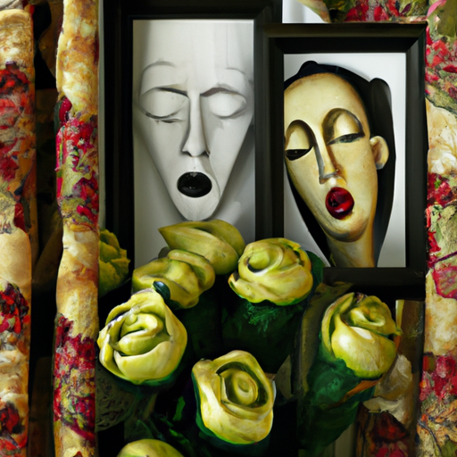
Vladimir Mayakovsky's visual style, prominent in the early 20th century, is characterized by bold typography, stark geometric shapes, and striking contrasts. His innovative designs and use of imagery helped shape the visual language of Russian Futurism.
View StyleExplore Style
Zack is a visual style that emerged in the late 1990s and remained popular throughout the early 2000s. It is characterized by its edgy and grungy aesthetics, often featuring bold and distorted typography, vibrant colors, and heavy use of texture. This style gained fame through its association with the alternative music and underground skateboarding scenes of the time, and it became iconic for its rebellious and non-conformist vibe.
View StyleExplore Style