
A Place To Bury Strangers
A dark and intense visual style characterized by distorted and noisy imagery, reminiscent of the post-punk and noise rock music of the band A Place To Bury Strangers.
View StyleExplore Style Stylopedia
A visual encyclopedia of post-punk styles – use as prompt inspiration for Midjourney, Gemini, or ChatGPT AI when making post-punk images
A dark and intense visual style characterized by distorted and noisy imagery, reminiscent of the post-punk and noise rock music of the band A Place To Bury Strangers.
View StyleExplore Style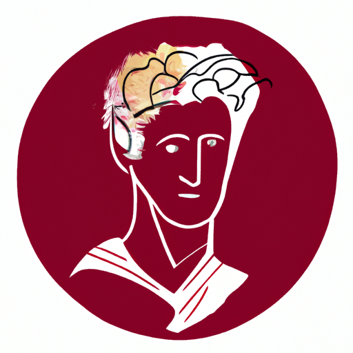
The visual style of David Byrne is characterized by its bold, eclectic and unconventional nature. It emerged in the late 1970s and gained prominence during the 1980s. Known for his work as a musician, artist, and performer, David Byrne's visual style became famous through his collaborations with various artists and designers. Byrne's style is a fusion of avant-garde, post-punk, and pop art, incorporating elements of surrealism and minimalism. His use of vibrant colors, geometric patterns, and the juxtaposition of seemingly unrelated objects create visually captivating and thought-provoking compositions. This style gained a significant following due to its innovative and boundary-pushing approach to visual expression.
View StyleExplore Style
Factory Records was a visual style popularized in the late 1970s and throughout the 1980s. It played a significant role in the post-punk and new wave music scene. Known for its minimalistic and avant-garde approach, Factory Records embraced the use of bold colors, geometric shapes, and innovative typography. Its famous album covers and promotional materials were often created by notable graphic designers such as Peter Saville and Ben Kelly, becoming iconic symbols of the era.
View StyleExplore Style
Fad Gadget was a visual style popular in the 1980s known for its avant-garde, post-punk aesthetic and DIY approach. Characterized by dark, edgy imagery, mixed media, and political commentary.
View StyleExplore Style
Ian Curtis is known for his distinct visual style in the post-punk era of the late 1970s and early 1980s. This style gained prominence during his time as the lead singer of the band Joy Division from 1977 to 1980. Curtis became famous for his hauntingly expressive performances and introspective lyrics, which often explored themes of despair, alienation, and inner turmoil. His visual style was characterized by a minimalist and stark aesthetic, with a focus on monochromatic tones and angular shapes. It reflected the bleakness and intensity that characterized his music and lyrics. Ian Curtis's style continues to be revered and has had a significant influence on subsequent generations of musicians and artists.
View StyleExplore Style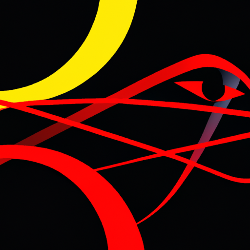
Joy Division is a visual style that emerged in the late 1970s and early 1980s, particularly associated with the famous Manchester band of the same name. The style is characterized by its minimalistic and stark imagery, often in black and white. It is influenced by industrial aesthetics, post-punk culture, and the band's dark and introspective music. The iconic album covers for Joy Division, designed by Peter Saville, played a significant role in popularizing this visual style.
View StyleExplore Style
Neville Brody is a graphic designer known for his bold, aggressive and innovative typographic designs. He rose to fame in the 1980s and 1990s through his work with influential music publications like The Face and Arena. Brody's distinctive style captured the energy and rebellious spirit of the punk and post-punk subcultures. He popularized the use of unconventional typography, combining different typefaces, sizes, and orientations to create visually striking and dynamic layouts. Brody's designs broke traditional design rules and challenged the status quo, making him a pivotal figure in the evolution of graphic design.
View StyleExplore Style
New Wave Fashion emerged in the late 1970s and early 1980s as a visual style that combined elements of punk, post-punk, and new wave music with avant-garde and futuristic fashion. It gained popularity in cities like London, Paris, and New York and was highly influenced by the emergence of music genres like New Wave and Synthpop. Known for its bold and unconventional designs, New Wave Fashion incorporated elements such as asymmetry, oversized proportions, and bright colors. This style became famous for its innovative and rebellious approach to fashion, representing a departure from traditional norms and an embrace of individuality.
View StyleExplore Style
The visual style of Public Image Ltd (PiL) emerged in the late 1970s and gained prominence throughout the 1980s. Known for their experimental and innovative approach, PiL's visual style embodies a juxtaposition of punk rebellion and post-punk aesthetics. Their iconic album covers, designed by British artist John Lydon (aka Johnny Rotten) and graphic designer Dennis Morris, often feature collage-like compositions, bold typography, and provocative imagery. PiL's visual style, with its gritty and raw elements, became synonymous with the band's confrontational and anti-establishment ethos.
View StyleExplore Style
The visual style of Sonic Youth was characterized by a combination of punk, post-punk, and alternative rock influences. Known for their use of abstract and chaotic imagery, Sonic Youth's visual style gained fame in the 1980s and 1990s.
View StyleExplore Style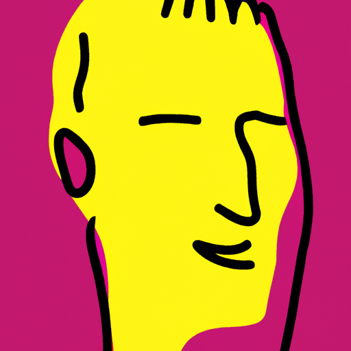
Talking Heads was an American rock band formed in 1975. The visual style associated with the band is characteristically eclectic, combining elements of new wave, punk, post-punk, and art rock. Their style was renowned for its minimalist yet innovative approach, incorporating unconventional instrumentation, quirky lyrics, and the charismatic stage presence of lead singer David Byrne. The band's visual aesthetic often featured bright colors, geometric shapes, and surreal imagery, reflecting their experimental and avant-garde music. Talking Heads' unique style became influential in the late 1970s and throughout the 1980s.
View StyleExplore Style
The Durutti Column is a visual style that emerged in the late 1970s and gained popularity in the 1980s. Known for its eclectic mix of abstract imagery, collage-like compositions, and unique use of textures, this style encompasses both graphic design and album cover artwork. Its founder, Vini Reilly, was the driving force behind this visual style, which became synonymous with Factory Records. The combination of hand-drawn elements, photography, and minimalist typography set The Durutti Column apart and made it famous among post-punk and new wave music enthusiasts.
View StyleExplore Style
The visual style of The Sisters Of Mercy is characterized by a gothic aesthetic with influences from post-punk and new wave music. Formed in the early 1980s, the band's dark and brooding imagery became synonymous with the goth subculture, influencing fashion and design in the alternative music scene.
View StyleExplore Style