StylopediaStylopedia

Data visualization styles on Stylopedia

A visual encyclopedia of data visualization styles – use as prompt inspiration for Midjourney, Gemini, or ChatGPT AI when making data visualization images

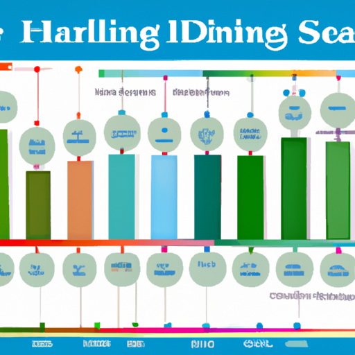
Example of visual style of Ben Fry

Ben Fry

Ben Fry is a computational designer known for his data visualizations. His visual style is characterized by intricate and detailed data representations, combining art and science. Fry's work gained fame in the early 2000s with his influential book 'Visualizing Data,' which introduced groundbreaking techniques for visualizing complex datasets. His visualizations often explore the interplay between data, algorithms, and visual design, creating visually engaging and informative pieces.

View StyleExplore Style
Example of visual style of Charles Minard

Charles Minard

Charles Minard was a 19th-century French civil engineer known for his innovative and influential visual displays of statistical data. His most famous work is the visual representation of Napoleon's Russian campaign, often referred to as 'Minard's Map'. This groundbreaking piece of data visualization showcases the devastating loss of life and the drastic decline in temperature experienced by Napoleon's army. It became famous for its ability to effectively communicate complex information and has since been hailed as one of the greatest examples of data visualization in history.

View StyleExplore Style
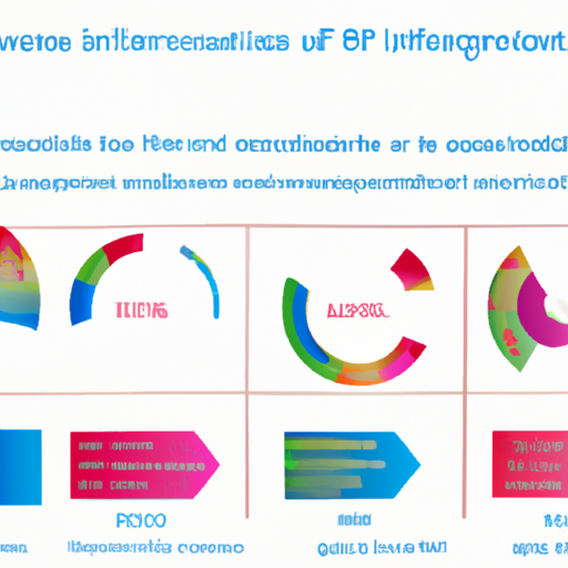
Example of visual style of David McCandless

David McCandless

David McCandless is a data journalist and information designer known for his distinctive visual style that combines data and information to create innovative and engaging visualizations. He rose to fame in the late 2000s with his book 'Information Is Beautiful', where he showcased his unique approach to presenting complex information in a visually appealing and easily understandable way. McCandless became famous for his ability to transform dull and confusing data sets into captivating and insightful visualizations that allowed viewers to gain new perspectives and insights. His style emphasizes the use of color, typography, and iconography to convey information effectively.

View StyleExplore Style
Example of visual style of Edward Tufte

Edward Tufte

Edward Tufte is a prominent data visualization expert and professor emeritus of political science, statistics, and computer science at Yale University. His work in the field of visual design and data presentation has greatly influenced the way information is communicated. Tufte's style, which emerged in the late 20th century, emphasizes clarity, simplicity, and the elimination of unnecessary decoration. His famous book 'The Visual Display of Quantitative Information' (1983) brought him widespread recognition. Tufte's style became famous for its emphasis on conveying large amounts of data coherently, minimalism in design, and the use of high-quality graphics and typography.

View StyleExplore Style
Example of visual style of Giorgia Lupi

Giorgia Lupi

Giorgia Lupi is an Italian information designer known for her unique and distinctive visual style. Her work is characterized by playful and artistic data visualizations that merge creativity and analytical thinking. Lupi became famous for her innovative approach to data visualization, which she refers to as 'Data Humanism'. She gained recognition in the early 2010s for her collaboration with the design studio Accurat. Lupi's style emphasizes the human perspective in data-driven storytelling and aims to foster empathy and understanding through her expressive and narrative visualizations.

View StyleExplore Style
Example of visual style of Hans Rosling

Hans Rosling

Hans Rosling, a Swedish statistician and public speaker, is famous for his visually engaging and data-driven presentations. With his innovative use of animated and interactive charts, he revolutionized the way statistical information is presented. Rosling rose to prominence in the early 2000s with his TED Talks, where he demonstrated his captivating style of using data visualization to communicate complex global issues. His emphasis on storytelling, combined with his passion for global health and development, made his presentations both informative and entertaining, leaving a lasting impact on the field of data visualization.

View StyleExplore Style
Example of visual style of Information Is Beautiful

Information Is Beautiful

Information Is Beautiful is a visual style that emerged in the early 21st century. It gained popularity due to its innovative approach to presenting complex data and information in a visually appealing and easily understandable manner. This style focuses on transforming raw data into stunning visual representations, using carefully chosen colors, typography, and graphic elements to create meaningful and informative visualizations. With its emphasis on data-driven storytelling and the ability to communicate insights effectively, Information Is Beautiful has become widely recognized and influential in the field of data visualization.

View StyleExplore Style
Example of visual style of Martin Wattenberg

Martin Wattenberg

Martin Wattenberg is an American artist and computer scientist who is known for his innovative and visually striking data visualizations. His work gained prominence in the late 1990s and early 2000s, as he explored the intersection of art and technology. Wattenberg's visualizations often involve large datasets and strive to make complex information more accessible and engaging to a wide audience. His work became famous for its ability to reveal hidden patterns and insights within the data, fostering new understandings and perspectives.

View StyleExplore Style
Example of visual style of Nadieh Bremer

Nadieh Bremer

Nadieh Bremer is a data visualization designer known for her unique and imaginative visual style. Her work combines the beauty of art with the precision of data analysis, creating visually stunning and insightful representations. Bremer rose to prominence in the early 2010s, gaining recognition for her intricate and complex data visualizations. Her innovative use of color, typography, and interactive elements has made her style famous in the data visualization community.

View StyleExplore Style

Home